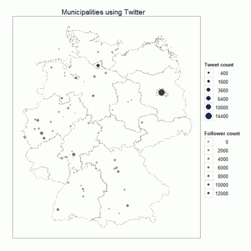
Plotting German municipalities using Twitter
More and more institutions do use social networks in Germany, including Twitter. This belongs to municipalities, too. Getting back to a idea of Claas Hanken (a ex-collegue of mine), wanted to visualize these ones. The result can be seen in German and in Englisch. The plot is completely done in R and I will show how it’s done.
As mentioned in the German post was mentioned that the raw data came from a simple tab-delimerted table with the Twittername, Homepage-URL and latitude and longitude information. A example for Berlin:
@berlin_de_news http://www.berlin.de 52.51, 13.40
The full data can be accessed here. So we load the data into R and do some data-management. Latitude and longitude are comma-seperated and there are no variable names given.
data < - read.delim("verwaltungen.txt", header = F)
lat_lon <- as.numeric(do.call("rbind", str_split(data$V3, ", ")))
data2 <- cbind(data[, 1:2], lat_lon[1:68], lat_lon[69:136])
names(data2) <- c("tw_name", "url", "lat", "lon")
Using the great twitteR-package from Jeff Gentry we can get the total tweets ever send and the actual follower. A little for-loop does some automatation for us.
for (i in data2$tw_name) {
  temp < - statusesCount(getUser(i))
  temp2 <- followersCount(getUser(i))
  if (i == "@ahlen_de") {
	count_tweets <- temp
	follower <- temp2
  } else {
	count_tweets <- append(count_tweets, temp)
	follower <- append(follower, temp2)
  }
}

data2 <- cbind(data2, count_tweets, follower)
Having the data prepared we only need a little spatial data from the GADM database of Global Administrative Areas. One could download the data by hand or using the raster-package (as I will do). Ggplot2’s fortify will then prepare the borders for plotting. If you get an Error from fortify try executing gpclibPermit().
de_map < - getData('GADM', country="DE", level=1)
de_map_2 <- fortify(de_map, region = "NAME_1")
Now it’s time to start the show! The plotting should take some time: The spacial data consists about 100k points. You could reduce the size by for example just taking every 5th point but that can cause double borders instead of one in some mapparts.
Usually one would start plotting the points (geom_point()). In this case it would cause the borders to overlap the municipalities. Scale_area() is very helpful because there is a gap between Berlin and the other cities. I also adjusted the limits of the Follower count. The rest should speak for itself.
tw < - ggplot(data= data2) + geom_path(data = de_map_2, aes(x = long, y = lat, group = group), colour = "#8D8D8D", linetype = 2)
tw <- tw + geom_point(aes(x = lon, y = lat, colour = follower, size = count_tweets)) + scale_area("Tweet count")
tw <- tw + theme_bw() + labs(x = NULL, y = NULL) + scale_colour_gradient(low = "#9D9D9D", high = "#242424", name = "Follower count", limits = c(0, 12000))
tw <- tw + scale_x_continuous(breaks = NA) + scale_y_continuous(breaks = NA)
tw <- tw + opts(title = "Municipalities using Twitter")
tw
An this is how it looks like:
